Saturday, November 2, 2019
Thursday, October 24, 2019
Wednesday, October 23, 2019
Thursday, October 17, 2019
Production: Logos

The basic design of the show's logo. The logo is intended to appear as a radio tower and a microphone formed using the title's initials (On Air) due to the subject matter of podcasting found in the programme. This is also accentuated by the wireless signals emanating out of the text. The closed circle represents the concept that despite how hard the characters try with their show within the fiction, no one else is listening to them


Variations of the logo for use within the website, one is used for the program itself and the other for the original audio content. The pastel colour scheme reflects the website's aesthetic reinforcing the brand identity.
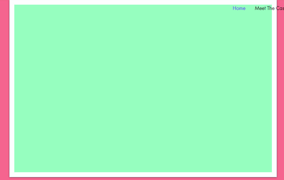
Production: Website Content
All Text Is Not Final And Subject To Change

A synopsis, menu bar, directions to access the content.

Episode Title and Content Player

Timeslot and content warning. Content warning follows the BBC Guidance Style (adult humour for mild language) found at http://downloads.bbc.co.uk/commissioning/site/Guidance_labels_final.pdf


Example of cast bio. Hover boxes used to convey further information. The yellow box will include a portrait of the character - switches to pronouns when hovered over with cursor. This helps to strongly establish the two social groups that I seek to represent.

Audio content player

BBC House Style Copyright Information
Production: Website Menu Bar and Footnote
The pages displayed on the menu bar reflect the menu bars on some BBC websites, keeping with the house style.


The footnote containing the copyright information has also been included, complete with a link to the BBC's linking guidelines.


(From my website)
The footnote containing the copyright information has also been included, complete with a link to the BBC's linking guidelines.
(From my website)
Subscribe to:
Comments (Atom)